Let’s be brutally honest: most Shopify stores are leaving serious money on the table not because of bad products, but because of bad UX.
If you sell custom or configurable products think personalized jewelry, made-to-order apparel, custom packaging, or bespoke gifts your product page isn’t just a listing. It’s a decision engine. Every friction point costs you a sale. Every confusing step sends a potential customer straight to your competitor.
Shopify product page UX for custom products is an entirely different beast compared to standard product pages. You’re not just showing a product you’re guiding someone through a personalized buying journey that can have dozens of variables, options, and emotional touchpoints.
In 2026, with AI-driven search, tighter consumer attention spans, and more competitive eCommerce spaces, getting your UX right is non-negotiable. This guide breaks down exactly what you need to do with 15 actionable, proven tips and a deep dive into the UX elements that directly move the needle on conversion rates and average order value (AOV).
Ready? Let’s get into it.
What Are Custom Product Pages in Shopify?
Custom product pages in Shopify are product listings that require the buyer to make one or more personalized selections before purchasing. These go far beyond the typical “choose your size and color” dropdown.
We’re talking about:
- Personalized products – engraved jewelry, monogrammed bags, custom prints
- Configurable products – build-your-own bundles, custom PC setups, bespoke furniture
- Made-to-order items – custom clothing, wedding stationery, specialty food boxes
- Variable products with complex options – multiple fabric choices, sizes, add-ons, engravings, and notes
Out of the box, Shopify’s default product page template wasn’t built for this complexity. Merchants often stitch together apps, metafields, and custom Liquid code to create a workable experience – but “workable” isn’t the same as “optimized.”
The best-performing custom product pages feel effortless. The worst ones feel like filling out a government form.
Why UX Matters More for Custom Products in 2026
Cart abandonment rates average around 70% globally (Baymard Institute), and can be significantly higher for custom products due to added complexity and decision friction.
In 2026, several macro shifts have raised the stakes for Shopify product page UX:
1. AI-Powered Search Has Raised User Expectations
Google’s AI Overviews and shopping integrations now surface product pages with rich metadata. If your page doesn’t have proper structured data, fast load times, and clear user intent signals, it won’t just underperform — it may not even rank.
2. Mobile Commerce Dominates
Over 70% of eCommerce traffic now comes from mobile devices (Statista, 2025). Custom product configurators that weren’t designed mobile-first are brutal to use on a 6-inch screen. Pinch-zooming through option menus is a conversion killer.
3. Consumers Expect Instant Clarity
TikTok and short-form content have conditioned buyers to expect immediate value. If your product page doesn’t communicate value, options, and next steps within 3–5 seconds, you’ve lost them.
4. Competition Is More Sophisticated
Shopify has over 4.6 million live stores globally. The brands winning in custom product niches are the ones investing in UX — not just product quality. Your product page is your salesperson, and right now, most salesperson are mumbling.
Core UX Challenges in Shopify Custom Product Pages
Before we jump into the solutions, let’s acknowledge what makes custom product pages particularly hard to get right.
Challenge #1: Option Overload
Custom products often come with many choices. The paradox of choice is real – too many options without proper hierarchy or guidance paralyzes buyers. Studies show that simplifying choices can increase conversions by up to 40% (Columbia University research, Iyengar & Lepper).
Challenge #2: Unclear Pricing as Options Change
Dynamic pricing – where the total cost changes based on selected options – confuses buyers if not handled transparently. “Why did the price jump? What did I add?” These micro-moments of confusion destroy trust.
Challenge #3: Input Validation and Error Handling
Custom products often require text input (names, messages, dates). Poor validation – catching errors only at checkout – leads to frustration and abandoned carts.
Challenge #4: Preview and Visualization Gaps
Customers buying custom products are making an emotional purchase. They need to see what they’re getting. Without a live preview or at least a high-quality representative image, anxiety about the final result creeps in.
Challenge #5: Mobile Configurator Usability
Most product configurators are desktop-first experiences bolted onto mobile. The result? Tiny buttons, overlapping elements, horizontal scrolling nightmares.
Challenge #6: Slow Page Load Times
Complex product pages with multiple image variants, configurator scripts, and app embeds can balloon page load times. A one-second delay in page load time can reduce conversions by 7% (Akamai study).
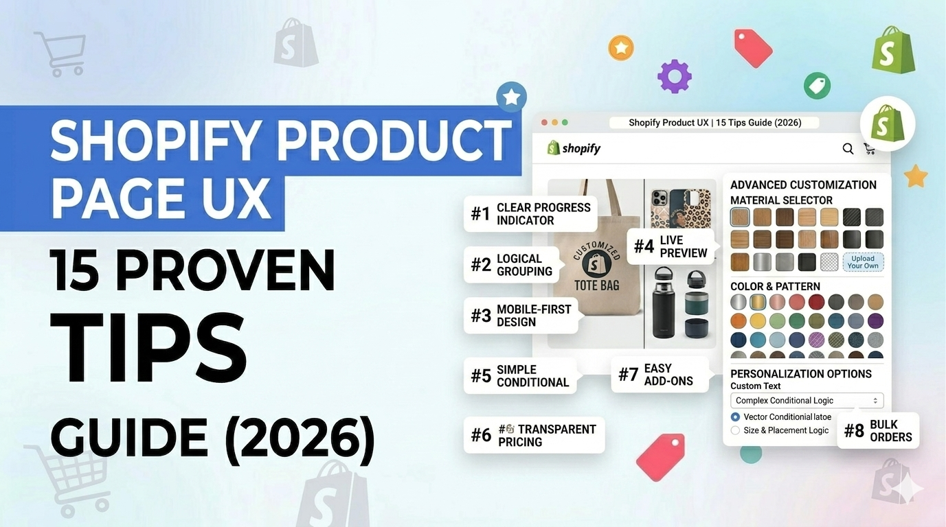
15 Proven Shopify Product Page UX Tips for Custom Products
Now let’s get into the good stuff.
Tip 1: Lead with a Compelling Product Hero Section
Your hero section the fold must do heavy lifting immediately. This means:
- A high-quality, contextual hero image showing the product in use (not just a white-background shot)
- A clear, benefit-led headline (not just the product name)
- Price visible above the fold never hide it
- A clear primary CTA (Start Customizing, Personalize Yours, etc.)
Don’t make buyers scroll to understand what they’re buying or what it costs.
Tip 2: Use a Step-by-Step Configurator (Not a Wall of Options)
Instead of dumping all customization options on the page at once, break the process into logical steps:
- Step 1: Choose your base product or size
- Step 2: Select material/color/style
- Step 3: Add personalization (text, upload image, etc.)
- Step 4: Review and add to cart
A progress indicator (“Step 2 of 4”) reduces cognitive load and dramatically decreases abandonment. Tools like Infinite Options, Bold Product Options, or custom Liquid implementations can achieve this.
Tip 3: Show Real-Time Price Updates
Dynamic pricing shouldn’t feel like a surprise. Every time a buyer makes a selection, the price should update instantly and visibly right next to the “Add to Cart” button.
Use a clear label like: “Total: $49.99 (includes personalization)”
This builds confidence and eliminates the anxiety of hidden costs.
Tip 4: Implement Live Product Preview
This is one of the highest-ROI UX investments for custom product stores. A live preview — even a simple text overlay on a product mockup gives buyers confidence in their purchase.
Options to implement this on Shopify:
- Kickflip (formerly Customily) excellent for product customizers
- Zakeke 3D product configurator
- Custom canvas-based previewer via JavaScript in theme customization
Even a static “how it will look” example image with engraving samples outperforms no preview at all.
Tip 5: Use Swatch-Based Selectors, Not Dropdowns
Dropdowns are UX dead weight for visual choices. If you’re offering color, material, or style options, use visual swatches. A buyer should be able to see their options not just read them.
Color swatches, fabric samples, or small thumbnail images reduce decision friction massively. Apps like Swatchify or Variant Image Automator make this straightforward to implement in Shopify.
Tip 6: Optimize for Mobile Configurators
Test your configurator on an actual mobile device not just Chrome DevTools. Common mobile UX failures include:
- Buttons too small to tap accurately (minimum touch target: 44x44px per Apple HIG)
- Text inputs that trigger undesired zoom-in
- Horizontal scrolling in option panels
- Sticky “Add to Cart” buttons that block content
Fix these, and you’ll see immediate lift in mobile conversion rates.
Tip 7: Add Inline Validation for Text Inputs
If your product accepts custom text (names, messages, dates), validate inputs in real time not at checkout. This means:
- Character counters (“You’ve used 18 of 30 characters”)
- Instant error messages for invalid characters
- Warnings for ALL-CAPS or unusual formatting (e.g., “Your text will appear exactly as typed”)
This prevents the painful experience of discovering an error after clicking “Place Order.”
Tip 8: Use Smart Defaults and Pre-selections
Don’t start your configurator on a blank slate. Pre-select the most popular option or the option with the best margin. This does two things:
- Reduces the intimidation of a completely open-ended form
- Nudges buyers toward higher-value configurations (which boosts AOV)
Just be transparent label pre-selected options as “Most Popular” or “Our Recommendation.”
Tip 9: Leverage Social Proof Contextually
Generic star ratings are fine — but for custom products, contextual social proof is far more powerful. This means:
- Reviews that mention specific customizations (“The engraving looked exactly like the preview!”)
- User-generated content (UGC) photos showing real personalized versions of the product
- “X people customized this product this week” live social proof counters
Embed these directly on the product page, not just on a separate reviews tab.
Tip 10: Clarify Production and Shipping Timelines
Custom products take longer to make and buyers know this. What they don’t tolerate is ambiguity. Be explicit:
- “Estimated production: 3–5 business days”
- “Estimated delivery: [calculated date range based on location]”
- “Order by [date] for delivery before [holiday]”
Use Shopify apps like Estimated Delivery Date or Monk Commerce to automate personalized delivery estimates. This alone can significantly reduce pre-sale support tickets and post-sale chargebacks.
Tip 11: Add a Sticky “Add to Cart” Bar
As buyers scroll through a long custom product page, the CTA button disappears above the fold. A sticky bottom bar showing the product name, current price, and “Add to Cart” keeps conversion intent accessible at all times.
This is especially critical on mobile, where scrolling is the primary navigation mode.
Tip 12: Use Exit-Intent Logic for In-Progress Customizations
If a buyer has started customizing and attempts to leave the page, trigger a gentle exit-intent prompt:
- “Don’t lose your design! Save it and come back anytime.”
- “You’re almost done complete your order and get 10% off today.”
This recaptures a significant percentage of nearly-converted customers. Tools like OptiMonk or Privy integrate cleanly with Shopify.
Tip 13: Make Your FAQs Page-Specific
Generic FAQs at the bottom of a product page are a missed opportunity. Your FAQ section should address the specific anxieties a buyer has about this product:
- “Can I see a proof before it’s made?”
- “What if I make a typo in my custom text?”
- “Can I return a personalized item?”
- “What file formats do you accept for custom uploads?”
Use FAQ schema markup to make these eligible for Google’s rich results, improving both CTR and SERP visibility.
Tip 14: Offer a “Save My Design” Feature
Not every buyer is ready to purchase immediately especially for high-ticket custom products. A “Save My Design” or “Save for Later” feature lets buyers:
- Bookmark their configuration with a unique URL
- Email themselves the saved design
- Return to complete the purchase without starting over
This feature is particularly powerful for AOV because it captures high-intent buyers who just needed more time not more convincing.
Tip 15: A/B Test Your CTA Copy Relentlessly
“Add to Cart” is the default but it’s not always the best choice for custom products. Test alternatives like:
- “Start My Order”
- “Customize & Buy”
- “Build Mine Now”
- “Personalize This”
More active, product-specific CTAs often outperform the generic default by 10–30% in split tests.
UX Elements That Directly Impact Conversion & AOV
Now let’s zoom in on the specific UX elements that have the most measurable impact on your two most important metrics: conversion rate and average order value (AOV).
1. The Product Image Gallery
Your image gallery is your most powerful trust-building UX element. For custom products, it needs to:
| Image Type | Purpose | Impact |
| Hero lifestyle shot | Emotional connection | High conversion lift |
| Customization close-ups | Show quality of personalization | Reduces returns |
| Multiple angle views | Eliminate visual uncertainty | Increases purchase confidence |
| UGC / customer photos | Social proof | +25–40% trust signal |
| Size/scale reference | Manage expectations | Reduces “it was smaller than I thought” reviews |
AOV impact: Galleries that show upsell variations (e.g., “upgrade to premium packaging”) directly create higher-ticket selections.
2. The Options/Configurator Interface
The configurator is where most conversions are won or lost. Key UX elements:
- Visual selectors over text dropdowns always
- Grouped options with clear labels (personalization vs. product specs)
- Conditional logic (only show relevant options based on previous selections)
- Error prevention, not just error correction
AOV impact: Smart defaults and “recommended upgrade” prompts within the configurator can increase AOV by 15–25% without any additional marketing spend.
3. Price Transparency and Dynamic Pricing Display
Buyers of custom products are hyper-aware of cost because they’re making active choices that affect the price. Your pricing UX should include:
- Real-time price update on every option change
- Clear breakdown of what’s included (base price + personalization fee + rush fee, etc.)
- “You save X with this bundle” messaging where applicable
- Price anchoring (show original retail vs. your custom price)
Conversion impact: Transparent dynamic pricing reduces the #1 reason for cart abandonment unexpected costs at checkout.
4. Trust Signals and Guarantee Messaging
For custom products, buyer anxiety is higher than for standard products because returns are often restricted. Combat this with strong trust signals directly on the product page:
- Satisfaction guarantee prominently displayed (“Love it or we’ll remake it”)
- Secure checkout badges near the CTA
- Money-back guarantee for cases where the product doesn’t match the preview
- SSL indicators and recognized payment logos
Conversion impact: Trust badges near the “Add to Cart” button have been shown to increase conversion by up to 32% (VWO research).
5. Product Videos and 3D Views
Video content on product pages can increase conversions by 80% (Animoto). For custom products, consider:
- A short “how it’s made” video (builds emotional value and justifies premium pricing)
- A “how to customize” walkthrough (reduces support tickets and increases completion rate)
- 360° spin or 3D view for physical products
AOV impact: Video that demonstrates the craftsmanship of premium options naturally encourages buyers to choose higher-tier configurations.
6. Upsell and Cross-Sell Integration Within the Page
The product page not the cart is the most effective place to introduce upsells. This is because buyers are in a “yes” mindset when they’re actively building their product.
Effective in-page upsell UX:
- “Add a matching [product] for $X more” displayed contextually as an option, not an intrusive popup
- “Upgrade to gift packaging” as a toggle in the configurator
- “Add a personal message card” for an additional $5
- “Protect your order with priority production” for a rush fee
AOV impact: In-page upsells during the customization flow can increase AOV by 20–35% without disrupting the buyer journey.
7. The “Add to Cart” Button and CTA Design
Your CTA button is the micro-conversion gateway. UX best practices for high-converting CTAs:
- High-contrast color that stands out from the page design
- Size: Large enough to be unambiguous on mobile (minimum 48px height)
- Copy: Action-oriented and product-specific (not just “Add to Cart”)
- Placement: Above the fold AND in a sticky bar as users scroll
- State: Visually disabled with a clear message if required options aren’t selected yet (“Please choose your text to continue”)
Conversion impact: CTA button optimization alone is responsible for conversion lifts of 10–30% in documented A/B tests.
8. Scarcity and Urgency Indicators
These need to be genuine manufactured scarcity is a trust killer in 2026. But real scarcity works:
- “Only 12 units of this base material left”
- “Order in the next 3 hours for delivery by [date]”
- “Peak season: production times are currently 5–7 days”
Conversion impact: Genuine urgency messaging reduces the “I’ll come back to this later” abandonment pattern that plagues custom product stores.
9. The Reviews and Ratings Section
For custom products, your reviews section needs special treatment:
- Filter reviews by customization type (e.g., show only reviews from buyers who chose “engraving”)
- Display customer photos prominently
- Highlight reviews that mention quality, accuracy of customization, and delivery experience
- Show your response rate to reviews this signals that a real team is behind the product
AOV impact: Higher review quality and contextual relevance directly correlates with conversion on higher-priced configurations.
10. Page Load Speed
This isn’t a “nice to have” in 2026 it’s table stakes. Google’s Core Web Vitals are a confirmed ranking factor, and slow pages directly tank conversion rates.
For custom product pages specifically:
- Lazy-load configurator scripts and non-critical assets
- Optimize and compress all product images (use WebP format)
- Use Shopify’s CDN effectively don’t load third-party scripts synchronously
- Aim for LCP (Largest Contentful Paint) under 2.5 seconds on mobile
A one-second improvement in page load time has been shown to increase mobile conversions by up to 27% (Google/Deloitte study).
Final Thoughts
Shopify product page UX is the single highest-leverage investment you can make in your custom product store right now.
You can have the best product in your niche. You can run the most dialed-in ad campaigns. You can have a massive email list. But if buyers land on a confusing, slow, or anxiety-inducing product page — you’re throwing money into a leaking bucket.
The good news? UX improvements compound. Every tip in this guide from real-time price updates to in-page upsells to mobile-optimized configurators layers on top of the others to create an experience that doesn’t just convert buyers once. It builds the kind of confidence that generates repeat purchases, referrals, and glowing reviews.
Start with the elements that have the highest impact for your specific store. Audit your current drop-off points using Shopify Analytics and tools like Hotjar or Microsoft Clarity. Then systematically implement, test, and optimize.
The brands that win in custom eCommerce in 2026 aren’t just the ones with the best products. They’re the ones with the best buying experiences.
Your next customer is one UX improvement away from clicking “Place Order.”
FAQ
Q1: What is the most important UX element on a Shopify custom product page?
The product configurator interface is arguably the most critical element for custom product pages. It’s where buyers either commit to a purchase or abandon the process. A well-designed, step-by-step configurator with visual selectors, real-time price updates, and live preview capabilities has the most direct impact on conversion rate for custom products.
Q2: How do I reduce cart abandonment on my Shopify custom product page?
Focus on three areas: (1) Eliminate pricing surprises by showing dynamic pricing updates in real time, (2) Add inline validation to catch input errors before checkout, and (3) Implement exit-intent prompts that offer to save the buyer’s in-progress customization. These three changes alone can recover a significant percentage of nearly-converted customers.
Q3: How can I increase AOV on my Shopify store without raising prices?
The most effective AOV strategies for custom product stores are in-page upsells during the customization flow (gift packaging, rush production, matching accessories), smart defaults that pre-select premium options, and contextual bundle offers. These feel natural to the buyer because they fit within the decision-making process they’re already engaged in.
Q4: Do I need a custom Shopify theme to implement these UX improvements?
Not necessarily. Many of these tips can be implemented through the Shopify App Store tools like Ultimate Custom Product Options, and OptiMonk cover most of the functionality described in this guide. However, for the best performance and brand consistency, working with a Shopify developer to implement custom solutions in your theme will always outperform app-stacked solutions.
Q5: How does page speed affect my Shopify custom product page conversion rate?
Dramatically. A one-second delay in page load time can reduce conversions by 7% or more. Custom product pages are particularly vulnerable because they often load heavy assets configurator scripts, multiple product images, and third-party apps. Use Google PageSpeed Insights to identify your biggest bottlenecks, and prioritize image optimization and lazy loading as first steps.